Lumen Dental A clinic that isn't frightening.
A flagship case: a digital dentistry page assembled in the order the questions arise in a patient's head, rather than to a designer's taste. A reel of treatment rooms instead of promises, an honest chapter about pain, a procedural 3D tooth taken apart layer by layer by a beam right in the browser, and a price list unfolded into a treatment route. Design, code and 3D by InterLAB. The clinic is fictional; this is a showcase of the approach.
point cloud · case study
this isn't a screenshot — that's the real site in the frame · hover to straighten it
The site in motion

What we built — and why
Screenshots of the live demo, not mockups.
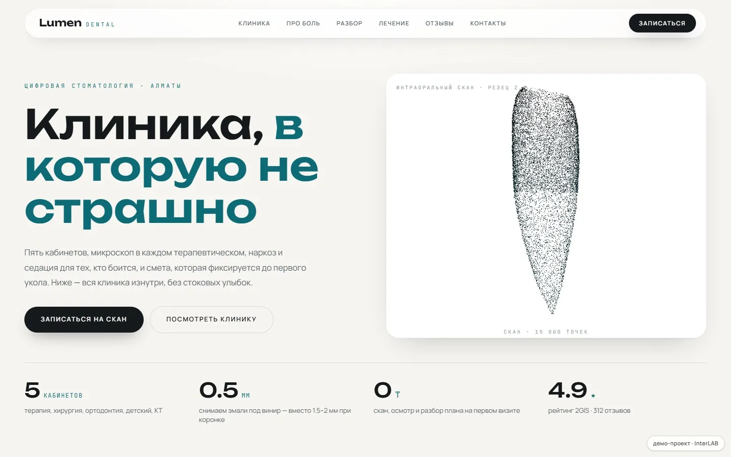
Chapters in the order patients ask
Not "about us — services — prices", but the way people actually choose a clinic: where will I go → what do you treat with → will it hurt → what goes in → what it costs → how to get there.
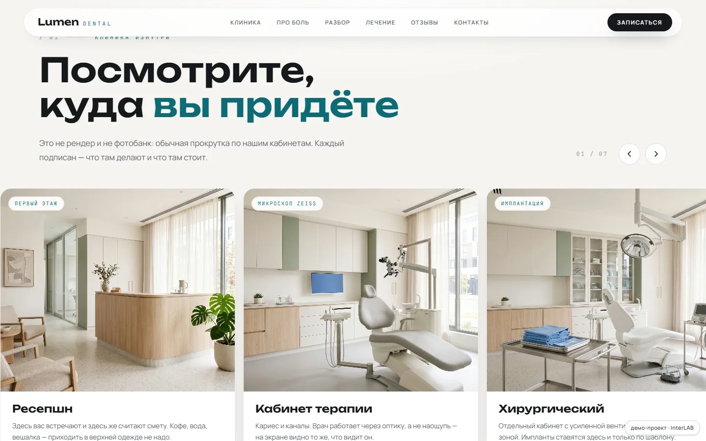
A strip of rooms instead of promises
The interior convinces better than adjectives, so the rooms run as a full-height strip you drag with a mouse or finger: one room at a time, like walking down a corridor.
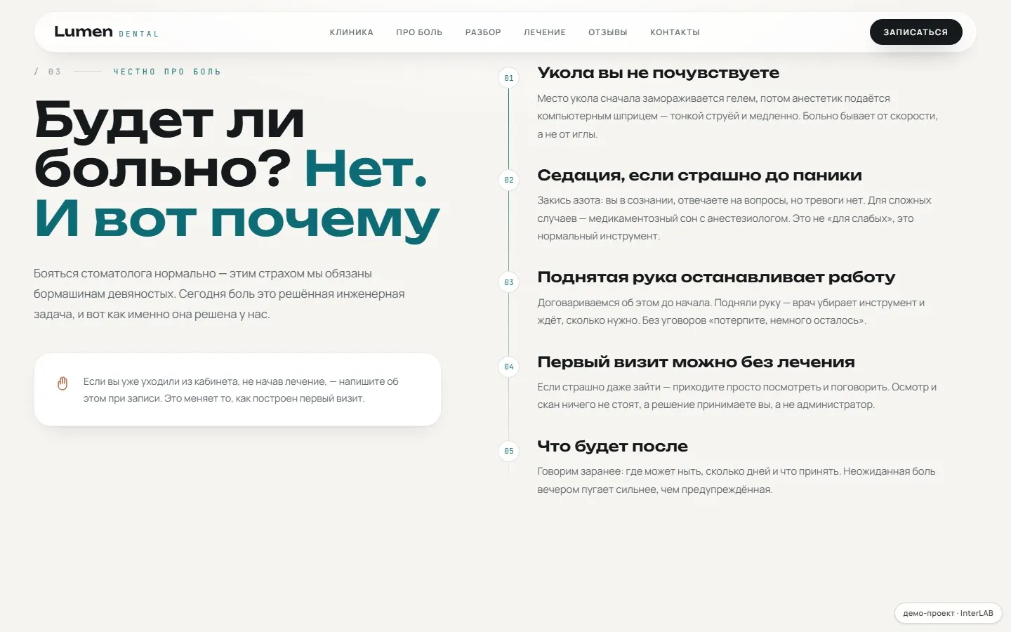
An honest chapter about pain
Instead of "painless treatment!" — concrete steps: a computer-controlled injection, sedation, a first visit with no treatment, what to expect after. And the right to raise a hand — the dentist stops.
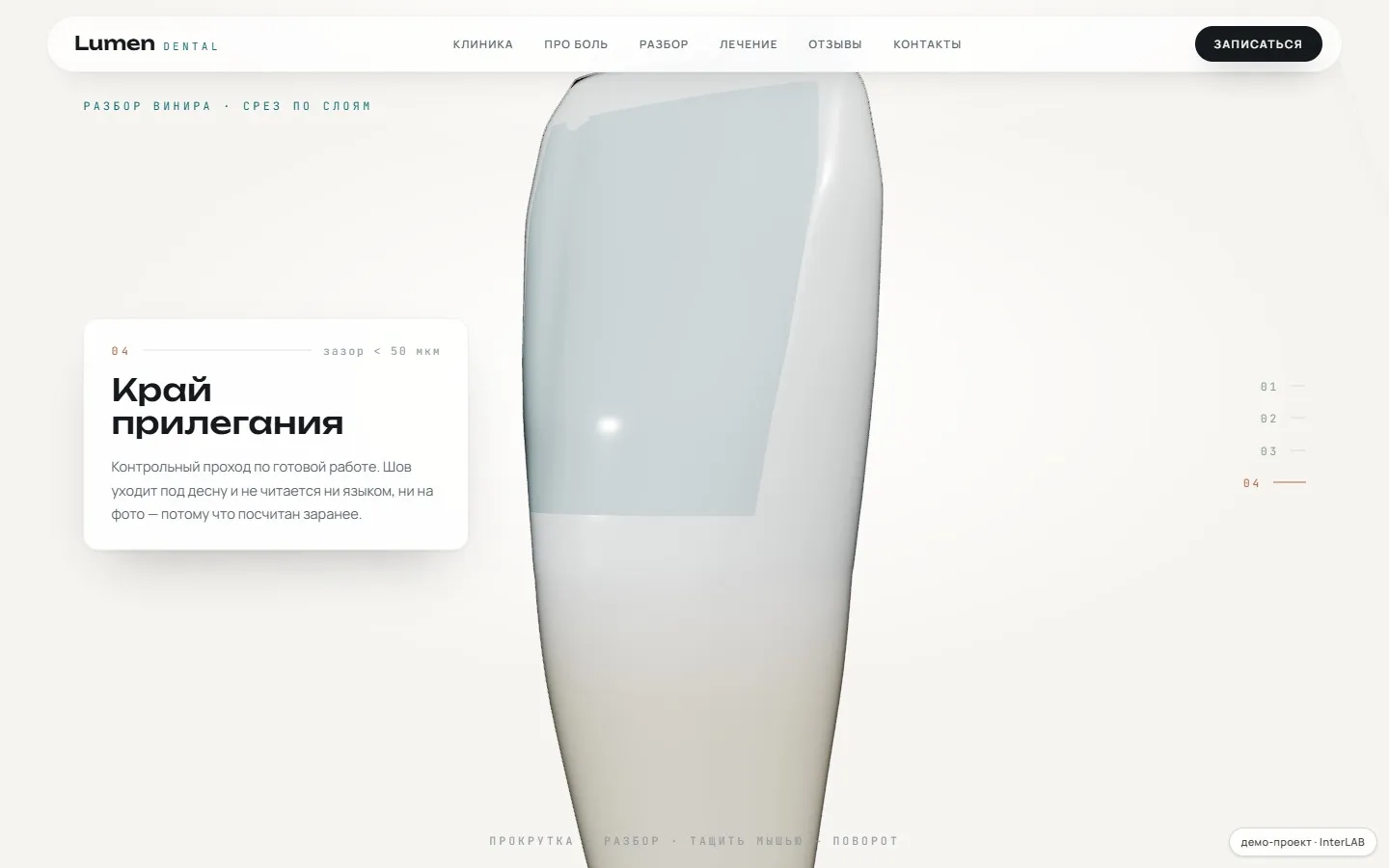
A light beam and a veneer cut in 3D
A beam travels up the tooth leaving a point cloud, like a real intraoral scan. Then the scroll removes a 0.5 mm enamel layer and puts ceramic in its place. The tooth is computed from a formula, so the veneer sits exactly in its seat.
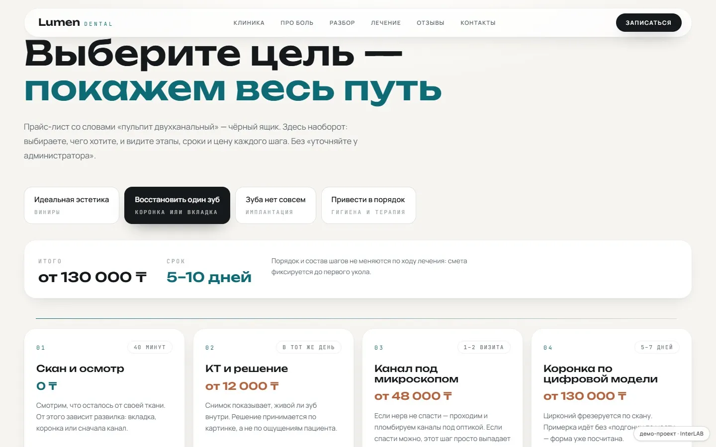
The price list becomes a route
Instead of a price list — pick a goal: aesthetics, a missing tooth, a general fix-up. The interface lays out a route with the stages, timing and price of each step; the first one costs 0 ₸, which removes the barrier to booking.
the pain in this niche
Premium dentistry is sold on words alone
Veneers and implants are expensive services bought on pure trust, and clinic websites don't build that trust: stock smiles, 'ask reception' instead of prices, and no explanation of what will actually happen in your mouth. The two questions that matter most — 'where exactly am I going' and 'will it hurt' — go unanswered almost everywhere. So people choose on the price of a cleaning.
the solution
Answer in the order people ask
The chapters follow the patient's questions rather than anyone's taste. First the reel of rooms: the interior shapes the sense of 'expensive and clean' more than any adjective. Then honesty about pain — down to the fact that a raised hand stops the dentist. Then the beam takes the tooth apart, showing that half a millimetre comes off for a veneer, not half the tooth. And only then the prices — as a route whose first step costs 0 ₸.
Palette, type pairing, stack. One niche — one system.
A clinic that isn't frightening
There are two kinds of white, and clinical blue-white is exactly the state polyclinic we're moving away from. Here it's warm paper, graphite instead of black, and two deliberately non-blue accents: petrol carries light and data, terracotta carries prices and booking. The display face is heavy at 600 — at large sizes it holds the page together.
- --bg#f7f5f1warm paper
- --surface#ffffffwhite card
- --ink#16191cgraphite instead of black
- --accent#0c6b75petrol: light and data
- --accent-2#b8623cterracotta: prices and booking
stack
Why it's built this way
Chapters follow the order patients ask
01Not 'about us — services — prices — contacts', but the way people actually choose a clinic: where will I be going → what will you treat me with → will it hurt → what exactly goes in → what does it cost → can I trust you → how do I get there. The order is the main decision here: it also determined which chapters exist at all.
structure from the user
A reel of rooms instead of promises
02The interior shapes the sense of 'expensive and clean' more than any adjective, yet it's usually buried in a small grid where the shots become icons. Here it's a full-height reel you drag with a mouse or a finger: you look at one room at a time, as if walking down the corridor and glancing through the doors.
drag gallery
An honest chapter about pain
03The most common unspoken question, and almost nobody answers it — they write 'painless treatment!' instead. Here there are five points, step by step: the computerised syringe, sedation, a first visit with no treatment at all, what will ache afterwards. And your right to raise a hand — the dentist stops and waits as long as needed.
working with fear
A beam instead of a before/after slider
04The standard slider with yellow and white teeth looks like cheap advertising. Here the clinic's name does the work: a beam runs up the tooth leaving a cloud of points behind it — that's what a real intraoral scan looks like — and then scrolling removes a 0.5 mm layer of enamel and puts 0.34 mm of ceramic in its place.
scroll → WebGL
The tooth is computed, not loaded from a file
05A single parametric surface yields three consistent objects: the tooth itself, the layer of enamel being removed and the ceramic. Any hand-modelled version would drift apart at the join — here the veneer sits in its socket by construction, which is why the margin can be shown in close-up.
procedural geometry
The price list unfolded into a route
06'Two-canal pulpitis' means nothing to a person. Instead of a price list there's a choice of goal: 'I want aesthetics', 'I'm missing a tooth', 'get things in order'. The interface rebuilds itself into a route with stages, a timeline and a price for each step, where the first one costs 0 ₸ — that's what removes the barrier to booking.
interactive roadmap
Full disclosure
'Lumen Dental' is a fictional clinic: a flagship demo in the InterLAB showroom, where prices, dentists and the address illustrate the format. The same site for your real clinic is built with your services, dentists, photos and WhatsApp number.
For a similar business
Want one like this — for your clinic?
We'll show you a draft on our subdomain before any payment. A reel of your rooms, a service broken down in 3D, a treatment builder and scan uploads over WhatsApp — as in the demo, but with your dentists, your prices and real photos of your clinic.
- Scope and risks estimated before we start
- NDA — yours or ours
- Work starts within a week