Нега SPA A walk through the salon instead of a gallery.
A brand site for a women's spa: instead of an interiors gallery, a cinematic walk driven by scroll; instead of a price list, three elements; instead of pop-ups, silence. Design, code and content by InterLAB. The business is fictional — this is a showcase of the approach, not a real client.
point cloud · a drop of oil
this isn't a screenshot — that's the real site in the frame · hover to straighten it
The site in motion

What we built — and why
Screenshots of the live demo, not mockups.
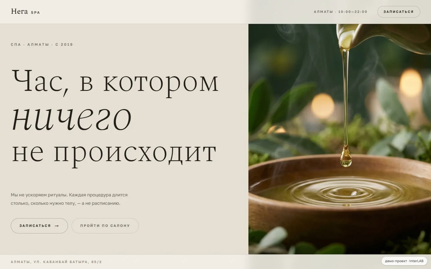
The first screen is a pause
"An hour in which nothing happens": light limestone, large airy serif type and a drop of oil. No pop-ups, no "we're online!" — the site is as quiet as the salon.
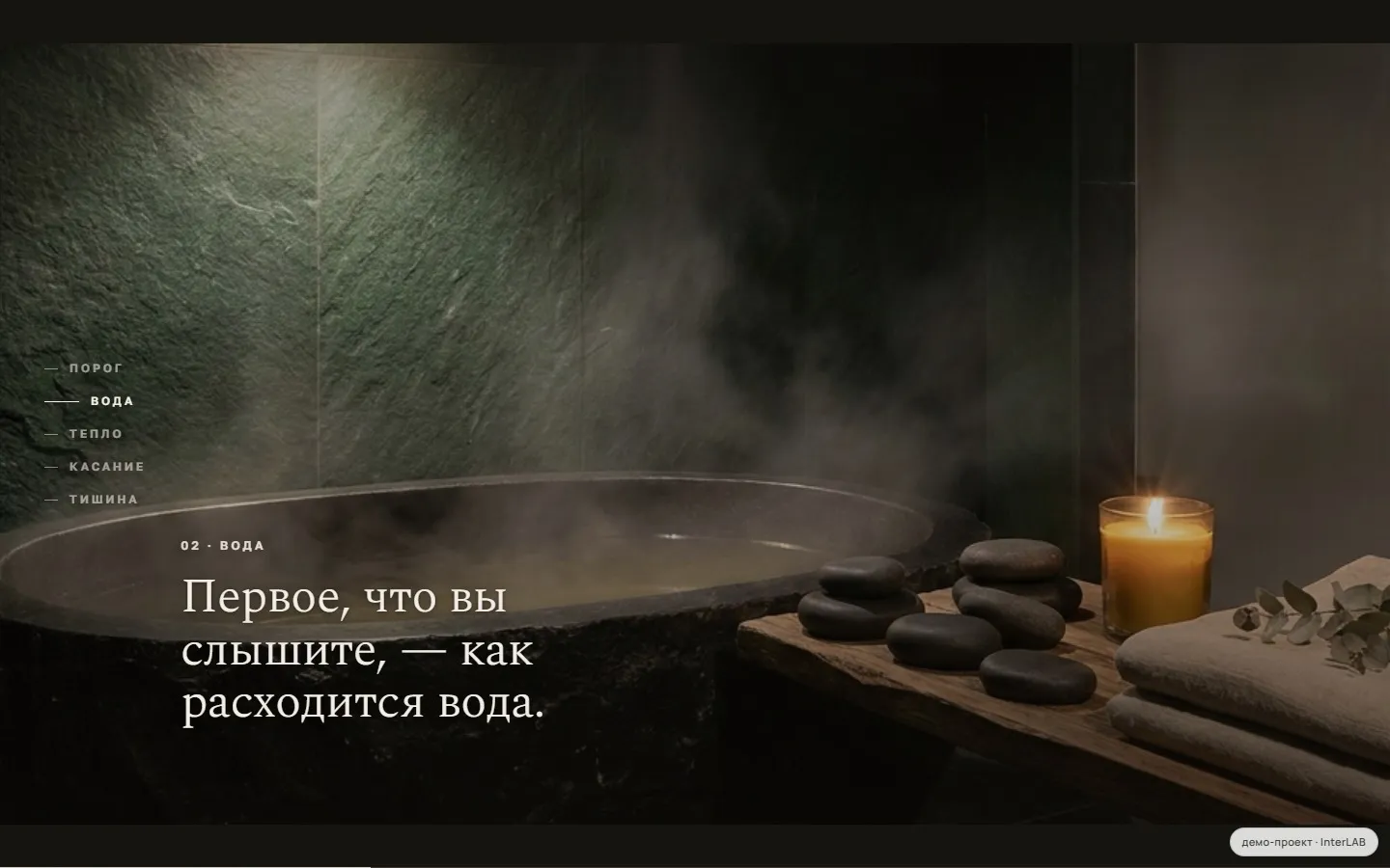
The scroll moves a camera through the salon
Instead of an interior slider — five chapters of a single visit: threshold, water, warmth, touch, silence. The camera keeps moving, and short lines come and go within each chapter.
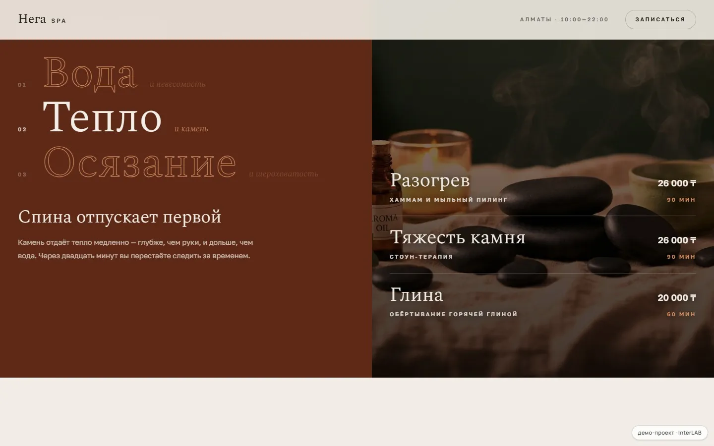
Three elements instead of a price list
The guest chooses a feeling — water, warmth, touch — and the procedure name comes second. Switching the element recolours the whole section: the conversation moves from price to value.
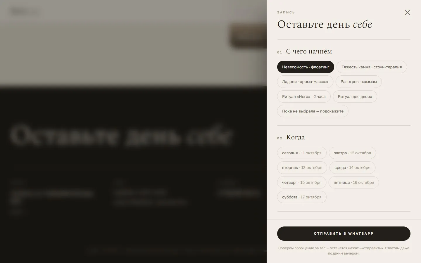
Booking without a single input field
Booking is a quiet side panel: ritual, day, time of day and a drink on arrival are picked in four taps, and the result is a ready-made WhatsApp message.
the pain in this niche
Premium sells a feeling, the website sells a price list
A spa charges a premium for atmosphere, but online it looks like every other one: a gallery of interiors, a table reading 'lymphatic drainage — X ₸' and a 'we're online!' widget on top of everything. A guest looking for somewhere to exhale at the weekend has only numbers to compare — so she goes wherever is cheaper, because there's nothing else to go on.
the solution
A walk instead of a gallery, a feeling instead of a price line
First the guest walks through the salon: five chapters of one visit, the camera always moving, short lines entering and leaving within each chapter. Then she chooses not a treatment but an element — 'Water and weightlessness', 'Warmth and stone', 'Touch and texture'; the clinical name is still there, just second in line. The prices haven't gone anywhere — the conversation simply reaches them after the feeling has been sold.
Palette, type pairing, stack. One niche — one system.
An hour in which nothing happens
Spectral at weight 200 — light at enormous sizes without becoming brittle; the italic is a true italic rather than one slanted by the browser, and it carries weight in the layout. Golos Text is Paratype's calm text grotesque. Both have native Cyrillic and both sit outside the default set every website builder offers.
- --stone#E6DFD4limestone
- --paper#F3EFE8paper
- --ink#221F1Bwarm graphite
- --voda#0F3941water
- --teplo#5E2917warmth
- --osyazanie#5D4B22touch
stack
Why it's built this way
Scroll moves a camera rather than paging through sections
01Nobody clicks a slider of interior photos — it looks dead and conveys none of the depth of the space. Here five chapters of a single visit run without a break: threshold, water, warmth, touch, silence. The camera is always moving — pushing in, pulling out, drifting — while short lines enter and leave within their own chapter. It feels like walking the corridors rather than browsing a gallery.
scroll-choreography · 5 chapters
Three elements instead of a price list
02'Lymphatic drainage' and 'thalassotherapy' read like a clinical reference book. The guest chooses a sensation — 'Water and weightlessness', 'Warmth and stone', 'Touch and texture' — while the clinical name of the treatment sits behind it in a smaller size. Changing element floods the whole section background rather than a small chip: the change of mood registers physically. That shifts the conversation from price to value and lets the salon hold its rates.
sensory navigation
Digital detox: not a single pop-up
03Pop-ups saying 'we're online!', callback widgets and discount banners destroy exactly what the salon is selling. There are none on the site at all. Booking is a quiet drawer on the right: four taps with no input fields at all (ritual, day, time of day, drink on arrival), producing an assembled message in WhatsApp.
zero-noise booking
Cyrillic that was drawn, not retrofitted
04The obvious 'luxury' choice of Playfair Display was ruled out: its Cyrillic reads as weak to anyone who knows the script. Spectral is a rare case where the Russian was drawn separately (Ilya Ruderman and Yury Ostromentsky, type.today), so the text has its own rhythm and a true italic. Golos Text is Paratype, with native Cyrillic. Both sit outside the default builder set: a site gets recognised as templated by its typeface before its layout.
Spectral · Golos Text
Full disclosure
'Nega SPA' is a fictional salon: a demo project in the InterLAB showroom, with prices and content that illustrate the format. The same site for your real business is built with your treatments, photos and WhatsApp number.
For a similar business
Want one like this — for your salon?
We'll show you a draft on our subdomain before any payment. A cinematic walk through your salon, navigation by sensation and quiet WhatsApp booking — as in the demo, but with your treatments and your photography.
- Scope and risks estimated before we start
- NDA — yours or ours
- Work starts within a week